Timeline: 4 weeks
Role: end-to-end UX/UI designer
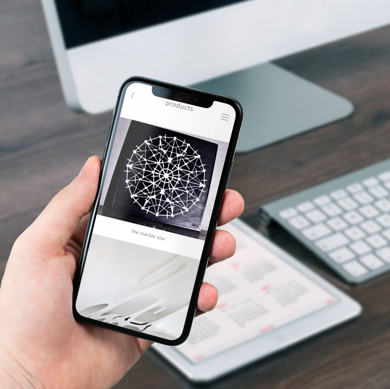
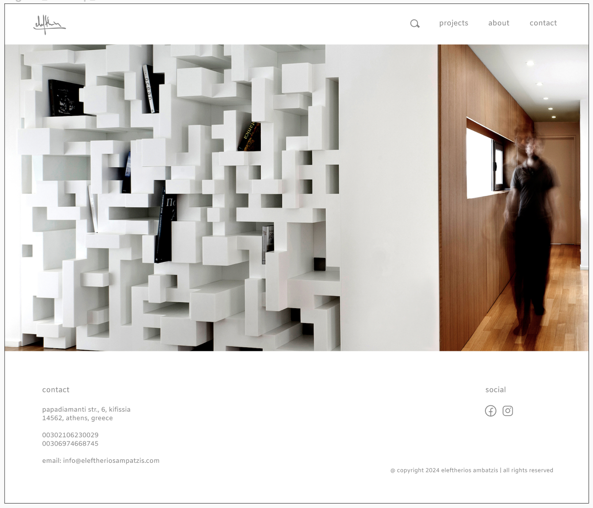
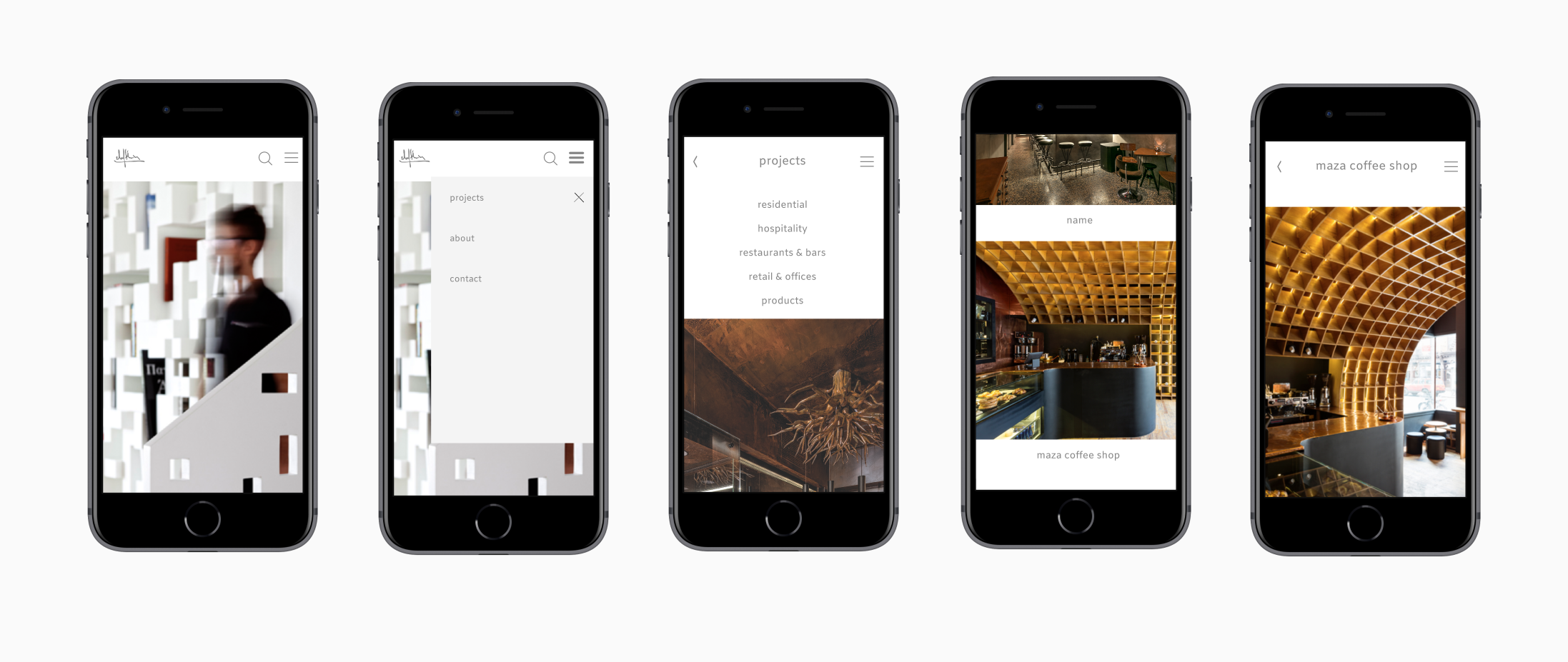
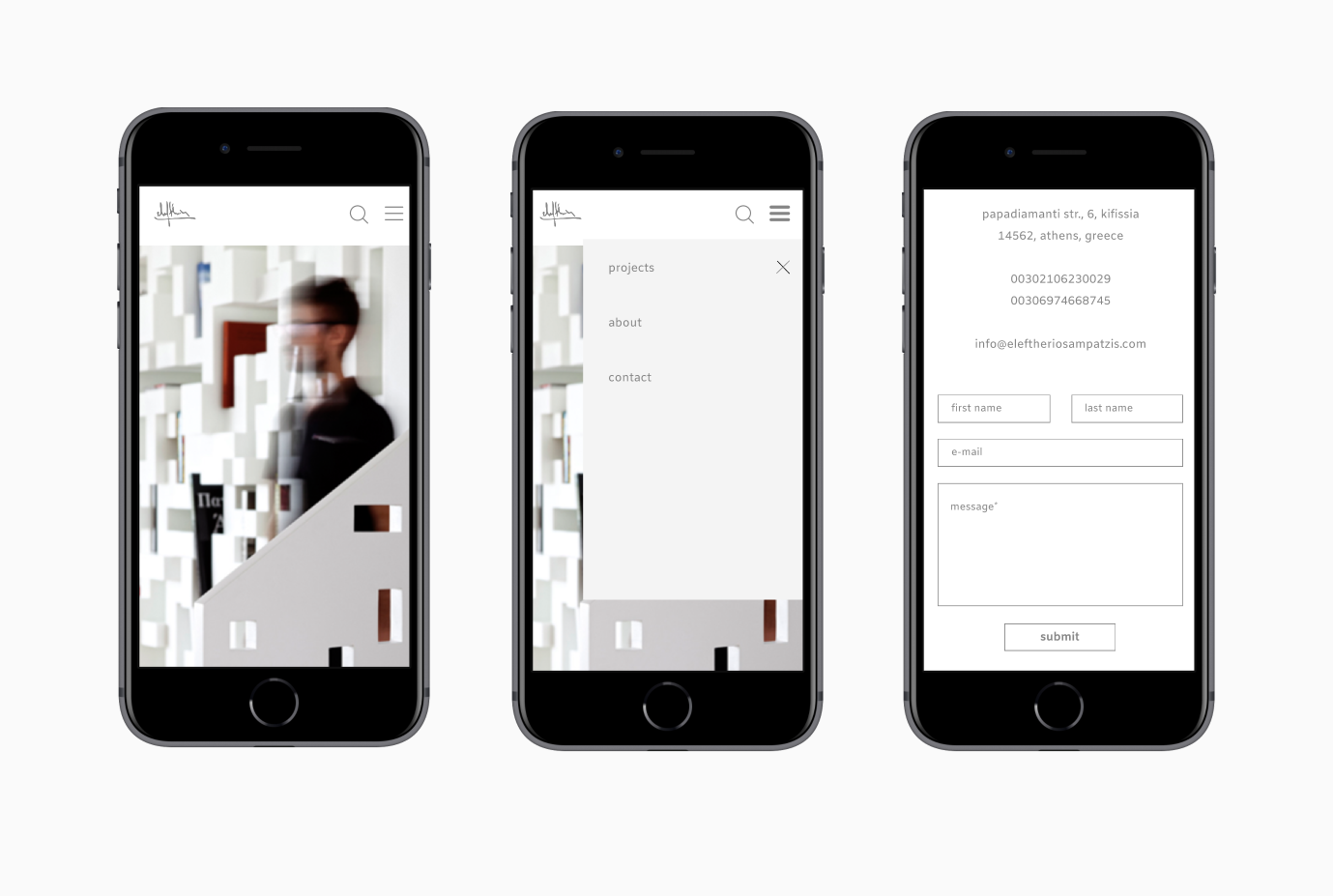
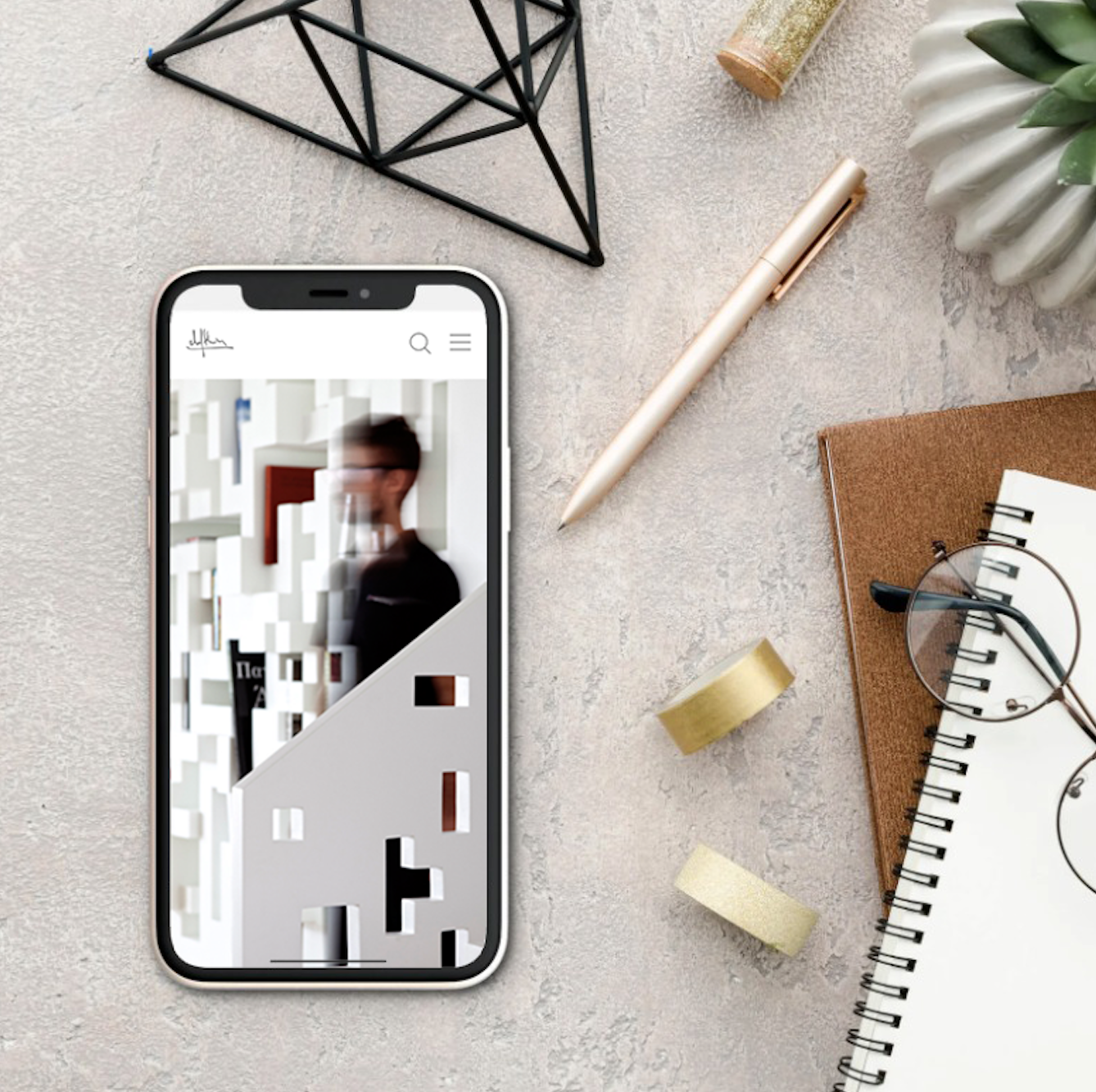
For this project, I was asked to redesign the website of an architect named Eleftherios and to create a responsive design that fits his current style.
The problem
The company's founder, Eleftherios, is mainly working on a word-of-mouth basis, where his previous clients recommend him to the next ones.
As a result, the company's online presence has been neglected - the projects uploaded are mainly very old ones, the style of the website is not what represents him nowadays and it’s generally difficult to navigate it.
The solution
Create a responsive website which is easy to navigate and reflects the architect’s style.
Goals
Create a responsive website that is easy to navigate and functional
The website should reflect the architect’s current style
Upload newer projects explaining what the company had to achieve
The website should be focused on both desktop and mobile
Redesign all the home page and the separate pages
Facilitate the process of contacting the architect in case the user is interested
Target Group
Gender: Women/Men/Other
Age: 20-65
Constraints
Complete the project in 65 hours
Discuss online with Eleftherios all the process and adjust everything to the way he desires while keeping responsiveness and inclusivity in mind
Competitor Analysis
These are the main competitors:
Analysis
Unique Value Proposition
Very modern design
Simple lines
Mostly use of white and grey
Urban settings
Company Advantages
Well-known in the Greek architectural scene
Recognisable style
Company Disadvantages
Limitations in creativity due to the specific chosen style
Lots of their projects look very similar
Unique Value Proposition
Use of natural elements
The buildings blend with the surroundings
The nature reinforces the architectural design
Company Advantages
They handle mainly bigger projects in Greece
Their projects are usually outside of the city
Company Disadvantages
They don’t have a lot of experience working in a smaller scale and in an urban environment
Unique Value Proposition
They take as inspiration the traditional architecture of each Greek place and combine it with modern trends
Company Advantages
Design that can look beautiful to both older and younger people due to its timeless aesthetic
Company Disadvantages
Sometimes their projects can look similar to the ones of other offices with the same values
The research
For the research, I used the Interviews method
Interviews
5 people who are either architects or would be searching for an architect to work with or collaborate with.
Some interviews were held online and some in person.
Insights
Most people are tired of very complicated architectural websites. They prefer something simple where they can search easily for a specific project or contact information.
Many design & architectural websites have darker screens, which can become tiring quite fast.
Categories can help a lot in the search process.
The Interviewees
-

Leo
He loves checking the websites of his favourite architects.
In general, he always does research about projects that use natural materials and are in contact with nature and he takes inspiration from them.
He doesn’t like it when websites are too fancy-looking, he wants them to be quite straight-forward without too much going on. He loves it when there are close-ups of the materials used so he can understand better the technique.
-

Thodoris
Thodoris belongs to the older generation of architects where he would normally just work with word-of-mouth and not so much using technology.
He already knows the architects he likes in the Greek scene but if someone would mention to him a new architect that he is interested about, he would check his website (only on desktop, not mobile).
He wants the information to be clear, without anything complicated and if he likes what he sees, he would go straight to the contact page to call the person.
-

Laura
She finds quite interesting when architectural websites have something different to show, so they don’t look all the same.
The most important thing for her is to be able to search directly for a specific project that she is interested in and then check similar projects, so the suggestions provided below a project for her is a must-have element.
When a website is too dark, which she finds happens quite often, she gets tired faster.
-

Mohamed
For Mohamed, it’s important to show some projects, so he can get a general idea of the style of the office, but then also to have the instagram page so he can see everything in more detail, or also the building process.
He would also check the “About Me” page to understand a bit more the person behind the brand. He doesn’t like it when there is too much going on, or too much video and sound, because it tires him and he often feels the need to just leave the website immediately.
-

Zahra
She would probably check the website first through her mobile, in case someone mentions an architect she would be interested in, and then if she would like to know more about, she would go on desktop.
She likes it when, apart from the main project photos, there are also photos of the sketches and the building process.
She finds it useful when there are different categories in the projects so she can find what she wants faster.
Affinity Map
Personas
Julia is a young architect whose work focuses on the use of natural materials and ecological techniques. She does a lot of research on sustainable architecture and she often looks for other architects with the same passion to collaborate. She takes part in lots of architectural competitions, so for her, collaborations with like-minded people are crucial. The most important thing for her when looking for a partner is to be able to see what projects they have already done, what is their approach to architecture and what materials they often use.
Goals:
check previous projects
check materials used
check the general architectural style
be able to contact the architect easily
Challenges:
hates it when she is bombarded by various effects and slides
doesn’t like endlessly scrolling the website
would like to be able to contact the architect easily
Julia, 37 years old - architect
John, 33 years old - In search of an architect
John is finally able to build his dream house. There are lots of options of available architects but he wants to find the right fit for him - someone who is close to his age, who can understand his needs, has a similar aesthetic and with whom he can communicate easily. In order to find the right person, he needs to check lots of different websites and make his decision based on the various projects presented and how easy it is to navigate the website in order to have a pleasant overall experience. An important thing for him is also to be able to see what challenges the architect had to face in different projects and how he overcame them so that he feels more confident about his decision.
Goals:
check previous projects
check the challenges the architect had to face
be able to understand the architect’s style clearly
easy communication
Challenges:
not overload of information
selective presentation of projects and styles
easy navigation on the website
doesn’t like it when the contact option is not easily found
Problem Statement
The projects presented on the website are mainly old and the list hasn’t been updated
Update the projects listed on the website
It’s difficult to navigate the website and contact the architect
Make the navigation and contact process easier
The style of the website doesn’t represent the current style of my client
Explore ways to redesign the website in order to reflect the current style of Eleftherios
The development
User Flows
Mid-Fi Wireframes
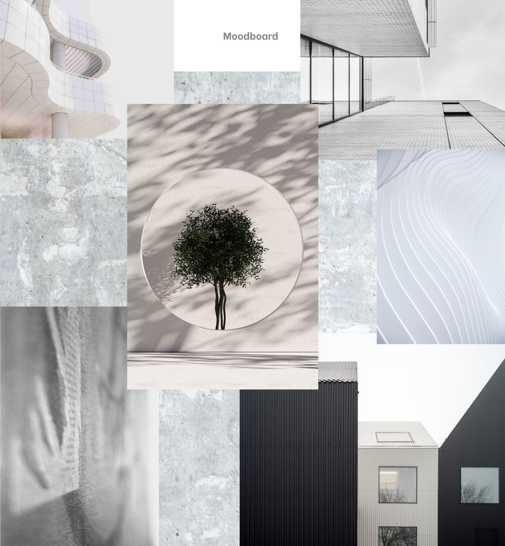
Mood Board
Style Tile
High-Fi Wireframes
Usability Test
5 participants were sent two links and were asked to complete the following tasks first on desktop and then on mobile:
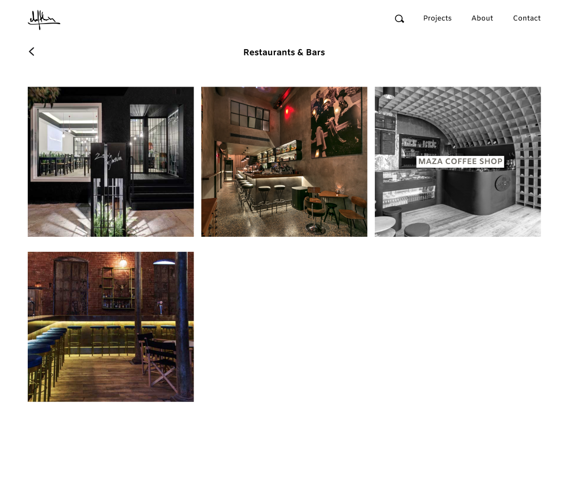
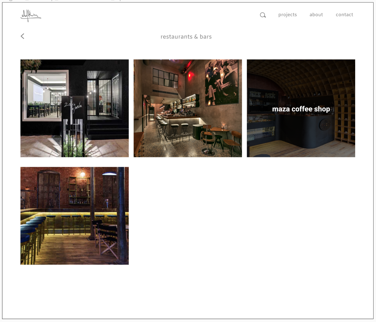
Check more information on a restaurant project
Check more information on a product
Contact the architect
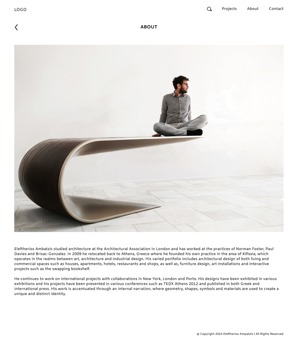
Check more information on the architect himself
Feedback
Tester 1
It would be more soft to the eye to make the letters dark grey instead of black.
He didn’t understand what he had to do with the first page (of the rusted metal) and he lost a bit of time there looking at it.
Tester 2
He suggested making the “Contact” button so that it would be more eye-catching but he said that either way it was quite clear where to find it. He also thought that maybe it would be clearer to have all the projects gathered on one page instead of going to different categories.
Tester 3
She spent some time trying to understand what to do with the first page. Quite fast, she figured out that she had to tap anywhere and it would take her to the landing page but she said it was a bit unnecessary. Also, she said it was not very clear what was written on top of the white image (when the mouse hovers on top of the image), so she suggested making the image darker with white letters instead.
Tester 4
Increase the line height on the About Me page so that it’s easier to read the text. The categories make sense and it’s easy to navigate through the website. The contact form, as well as the further contact information, make it easy to communicate with the architect.
Tester 5
She said she enjoyed navigating through the website and she found it quite easy to search for the information asked. However, the images are sometimes blurry and this could make the website look much worse because it is focused mainly on the images.
Final Result based on the feedback
Check more information on a restaurant project
Check more information on a product
Contact the architect
Check more information on the architect himself
Reflections
This project made me more confident as a UX designer since it was important to give suggestions that fit my client’s style and aesthetic, while at the same time taking into consideration the feedback I was getting during my research.
At some points, these two were not combined easily, and in those cases, I had to persuade my client that what he wanted to do would probably not be beneficial for the project and propose an alternative solution that would satisfy him.
This helped me practice my communication skills as well as my creativity, until we reached the point that the project was close to what he had imagined while at the same time being responsive, easy to navigate, and inclusive.
